Overview
How do you buy a train ticket when you can’t see the screen?
CP Para Todos is a research-driven adaptation of the CP (Comboios de Portugal) mobile ticketing app for blind users, built entirely on audio instructions and touch gestures, with no graphical interface at all. Beyond making the flow accessible, the study asked a deeper question: does the way an interface speaks change the experience?
We designed and tested two complete voice prototypes. One used machine-like speech, formal and command-oriented. The other used humanized speech, conversational and descriptive. Then we measured their emotional and trust impact through moderated usability tests.
| Role | Interaction Designer and UX Researcher (team of 2) |
| Context | MSc Interaction Design, Emotional Design course |
| Year | 2024/2025 |
| Methods | Wizard of Oz testing, proto-personas, Geneva Emotion Wheel, Wilcoxon signed-rank test, direct observation |
Problem
Digital mobility services are rarely designed with blind users in mind. For something as everyday as buying a train ticket, this costs people their autonomy: a task sighted users finish in a minute becomes impossible without help.
We rebuilt the CP flow around the interaction patterns blind users actually rely on, meaning audio feedback and on-screen gestures. Then we set two hypotheses about communication style.
- H1, machine-like speech. Formal, direct, command-oriented language should enable faster and more efficient interaction. But because it’s synthetic and low on context, it may compromise task comprehension for users who need more verbal support.
- H2, humanized speech. Informal, descriptive, conversational language should favour comprehension and comfort, at the likely cost of slightly longer task times.
Research design
Proto-personas
Two proto-personas with opposite technology and communication profiles drove the two prototype versions.
- Tomás, 22, blind for 5 years (acquired). Pragmatic and autonomous, and he knows screen readers well. He wants minimal steps and unambiguous instructions, and he hates redundant paths. He doesn’t want the app treating him like he’s clueless.
- Gilberta, 65, blind since birth (congenital). She values empathy and patience, and uses a screen reader with family support. She wants clear explanations of what’s happening, in language that feels welcoming rather than technical.
Audio-only prototypes
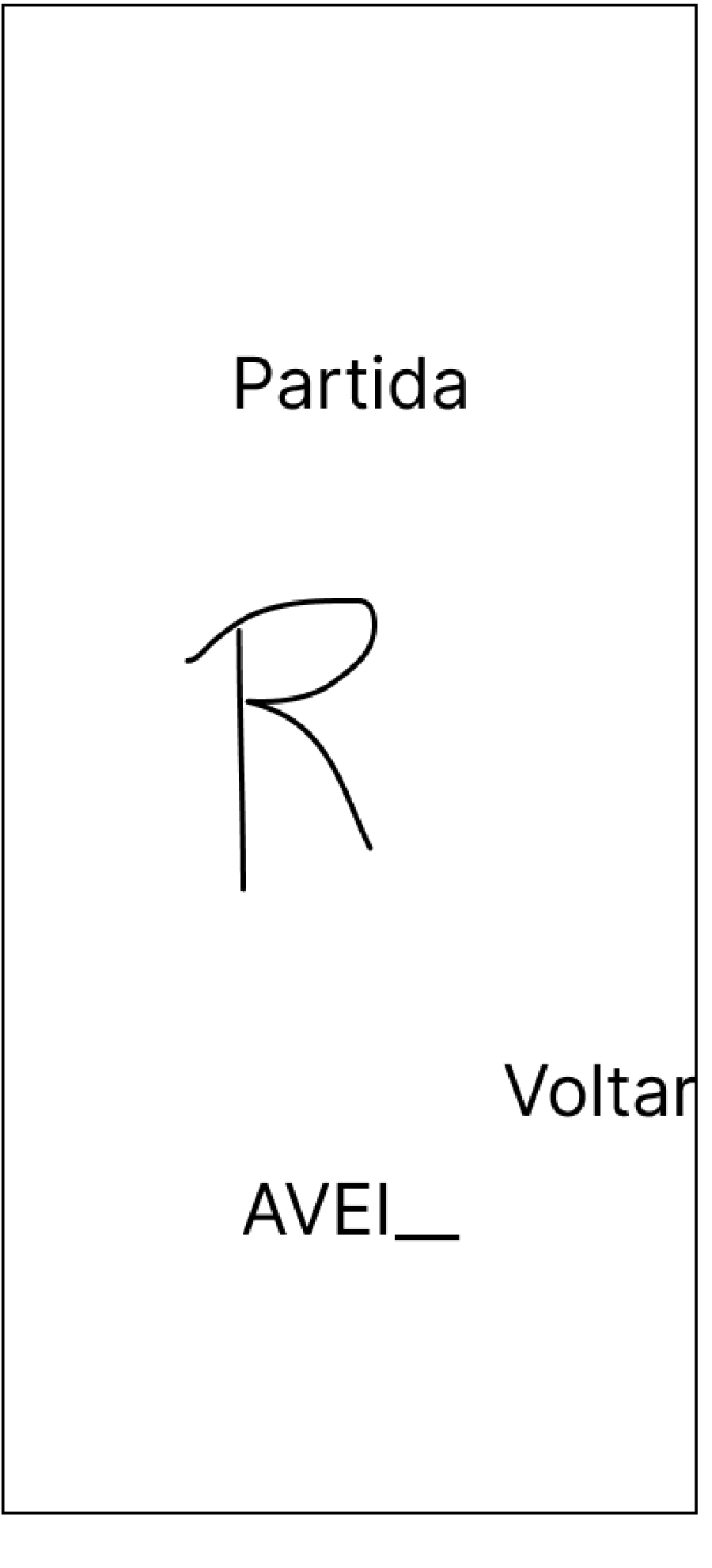
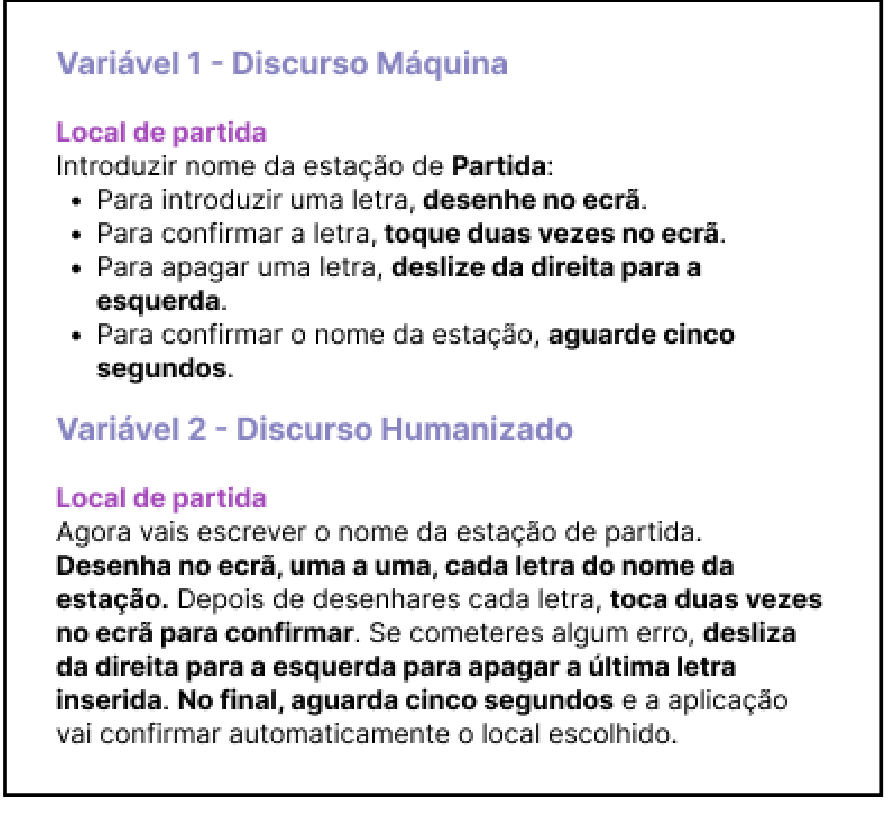
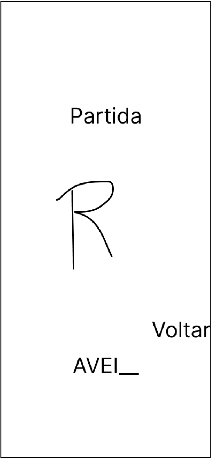
Since the target users are blind, the prototypes are recorded audio instructions paired with touch gestures. You draw letters on screen to spell station names, swipe right to left to delete, double-tap to confirm, and wait five seconds to commit. The interaction model came from A Blind Legend, a game built entirely on sound feedback, plus reference research on how blind people actually use smartphones.
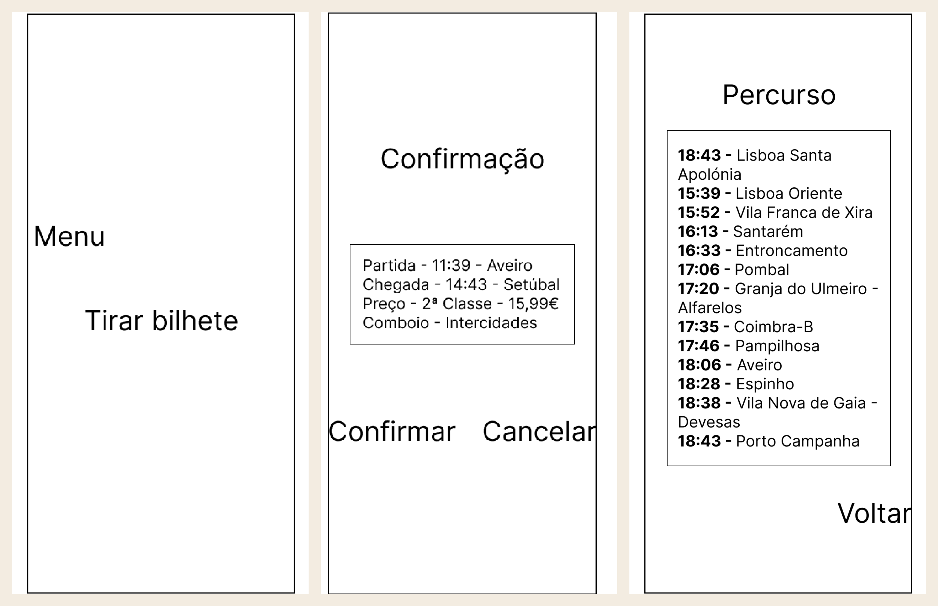
Figma was a structural tool only. We used it to organise the navigation logic of two tasks: buying a ticket, and consulting saved tickets. Every screen existed in two versions with identical function and a different voice.
Testing
Moderated usability tests with 10 participants (70% female, 90% aged 19 to 25). Only 10% used the CP app. The whole sample was tech-confident: 60% said they navigate apps comfortably, and 40% called themselves very experienced. Nobody in the sample was a nervous technology user.
Because of recruitment constraints, tests used simulated blindness, with sighted participants blindfolded throughout. That’s a real limitation, and I report it below.
Key methodological decisions:
- Wizard of Oz. Participants believed they were using a functional app. In reality we triggered the pre-recorded audio in real time based on their gestures, which let us test the full interaction with no development.
- Counterbalancing. Half started with the machine version and half with the humanized version, to control for learning effects.
- Tasks. First, buy a ticket from Aveiro to Setúbal for May 9th, from 14:30, 2nd class, with the youth discount applied. Second, consult a saved ticket’s details, meaning seat and carriage, full route, and additional information.
- Task briefs were delivered verbally, since blindfolded participants couldn’t read a script. A small detail that shaped how we ran every session.
- Measures. After each condition, participants reported emotions and intensities on the Geneva Emotion Wheel and rated their trust in each version. We took direct observation notes throughout.
Findings
Emotion: clarity vs. comfort in tension
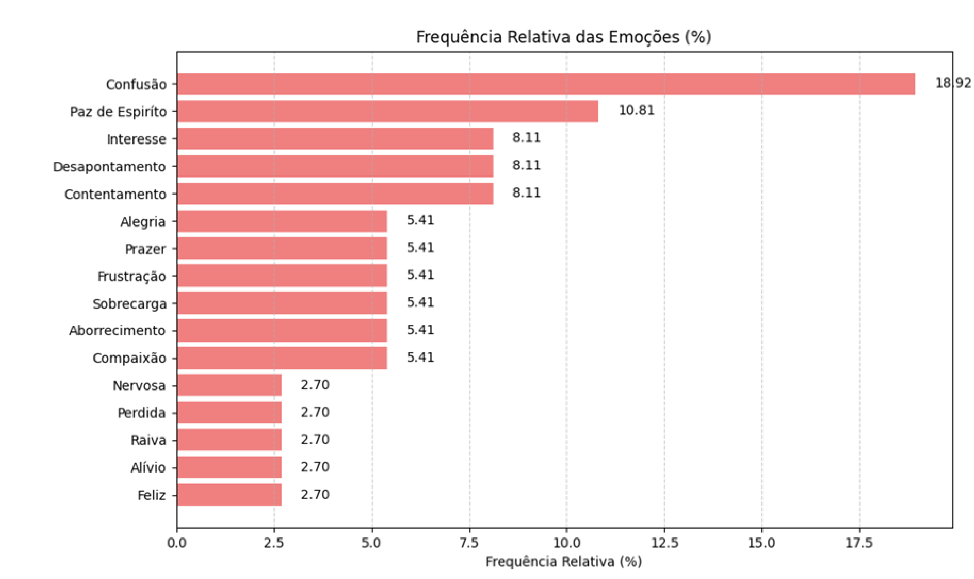
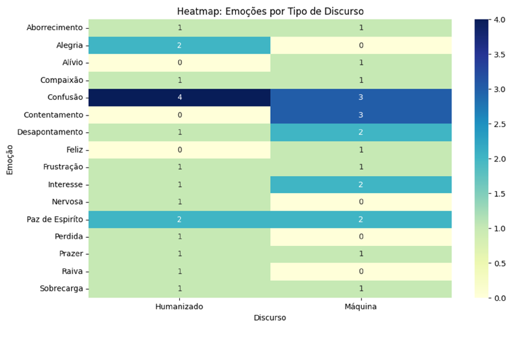
Confusion was the most frequent emotion, at 18.9% of all reports. That’s a clear signal of cognitive load in audio-only navigation. Several participants described the experience as “a memory game”, since with no screen to fall back on, every instruction had to be held in working memory. Worth remembering that this happened to a sample that was uniformly comfortable with technology.
At the same time, peace of mind (10.8%) was the most frequent positive emotion, followed by interest, contentment and disappointment at 8.1% each. The emotional picture was genuinely mixed, which is itself a finding.
Frequency and intensity told different stories. Boredom and joy were rare, but they were felt at the highest average intensity of 4.5. Rare emotions can still dominate an experience when they show up.
Emotion by discourse type
Speech style changed not just how much users felt, but what they felt.
- Peace of mind and joy clustered in the humanized version.
- Contentment and interest appeared more with the machine version, which fits its objective and direct character.
- Some emotions were exclusive to one version: happy and anger appeared only in the humanized condition, and relief only in the machine condition.
- Confusion showed up in both, and slightly more in the humanized version. The friendlier voice was also the longer one, and length costs working memory. Warmth didn’t buy clarity.
Trust: a tendency, not a significant difference
Participants tended to trust the humanized version more, with mean trust of 5.5 against 4.9. But the Wilcoxon signed-rank test showed the difference was not statistically significant (W = 11.0, p ≈ 0.41). With n = 10, the tendency can’t be generalised.
The qualitative notes explain the split. Some participants felt closer to the humanized narrator and preferred it for that reason. Others trusted the machine precisely because it felt infallible, and one said the machine is more reliable because it fails less. Another preferred the machine simply because the humanized version sounded less professional.
The design answer: flexibility, not a winner
Neither discourse won, and that’s the insight. Preferences tracked user profiles, exactly as the proto-personas anticipated: efficiency-oriented users leaned machine, and reassurance-oriented users leaned humanized. So an accessible interface should let users choose their communication style instead of imposing one voice on everyone. Humanization works as a trust lever, but only for the right user.
Learnings & next steps
What I’d stand behind is reporting a non-significant result honestly. The tendency favoured humanized speech, but with this sample, claiming more than that would be bad research. So we didn’t.
Limitations we own: a small (n = 10), age-skewed, tech-confident sample, and simulated blindness, which doesn’t reproduce the lived experience of blind users. Blindfolded sighted people lack the years of adapted strategies that real users have, like screen-reader fluency and spatial audio habits.
What we’d do next, as recommended in the study:
- Test with real blind users across a wider age range, in real mobility contexts.
- Cut the gesture vocabulary and add a short onboarding tutorial, so instructions stop re-explaining navigation at the end of every step. That attacks the cognitive-load problem behind all that confusion directly.
- Extend to more task scenarios to build consistency across the app.
What this project taught me is that accessibility work is emotional work. The biggest barrier we found wasn’t a missing feature. It was cognitive load and the feeling of being lost. Designing the voice of an interface is designing its trustworthiness.