Overview
tásAver is a gamified mobile app that promotes local heritage and tourism by letting people leave their emotions at the places they visit. It started as someone else’s object: the Muze, a physical device by our colleague Marta Reis, with emotion buttons for rating artworks in museums. Our brief in Project II was to take that artefact and give it a new digital identity. Not a port, a reinvention.
We expanded the concept from the museum to the city: itineraries through historical sites, location-locked quizzes, collectible cards, and a Geneva Emotion Wheel moment at the end of every visit where you record how a place made you feel, then see how everyone else felt.
The project ran through a full cycle: concept, low- and high-fidelity prototypes in Figma, an intermediate critique, a substantial redesign, and a mixed-methods evaluation with 10 users. The redesigned prototype scored a mean SUS of 83.75, in the “excellent” adjective range, and the dominant emotion users reported was interest (9 of 10 participants, mean intensity 4.22 out of 5).
From a museum button box to a city-wide game
The Muze let museum visitors press an emotion button in front of an artwork and see a vote counter. What we kept was the core insight: rating something emotionally is more engaging than rating it with stars. What we changed was everything else.
tásAver applies that emotional layer to urban cultural tourism. Users explore nearby monuments, gardens and viewpoints, follow themed itineraries (like “O Poeta em Lisboa”, a Fernando Pessoa route) or build their own, and unlock a quiz only when physically at the location. The padlock opens on site, which deliberately pushes exploration off the couch and into the street. Answering correctly earns a collectible card, a photo moment, and the Emotion Wheel.
The early phase covered market research, storyboards, user flows, proto-personas (young students, couples, teenagers), a moodboard, a style guide, and low- to high-fidelity prototypes.
The redesign: what the critique changed
The concept was first shown to the class as a storyboard, and that round of feedback pushed it towards a mobile app. After the intermediate presentation, professor feedback pointed at interface clarity, emotional connection and how the app communicates its purpose. We didn’t apply every suggestion. Each one was weighed for relevance, feasibility and impact, and the ones we took reshaped every major screen.
Homepage: from data dump to radar
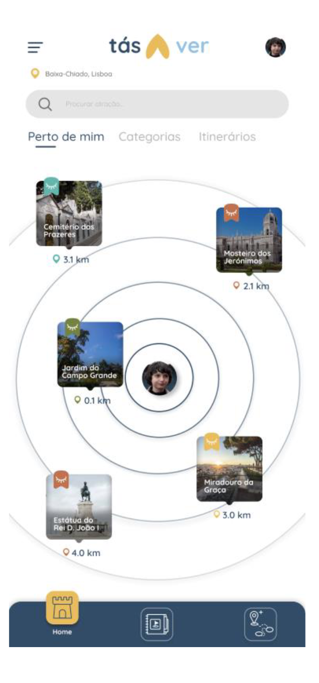
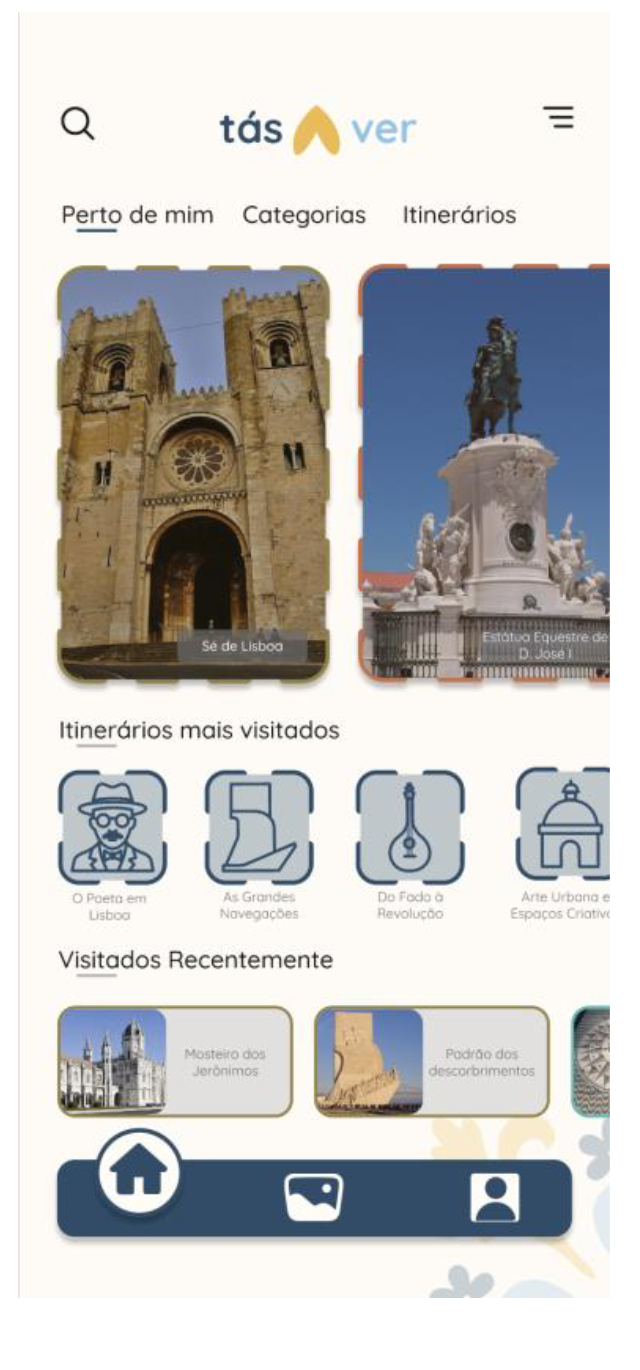
The first version front-loaded nearby places, itineraries and recent visits all at once. Visited places had a solid outline, unvisited ones a dashed outline, and a different colour per category sat on top of both, so three visual codes competed on one screen. The redesign centres the user’s avatar inside a distance radar, with each nearby place shown as a card at its actual proximity.
The eye icon, a functional pun
Visited state moved from outline styles to a small window on each place’s image, holding an open or closed eye. It marks visited and unvisited at a glance, and it plays on the app’s name: “tás a ver” is colloquial Portuguese for “you get it”, literally “you’re seeing”.
Categories and itineraries: less noise, more hierarchy
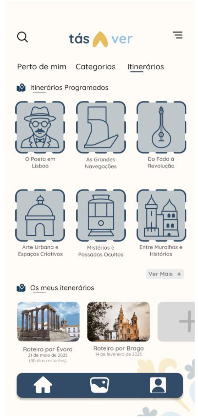
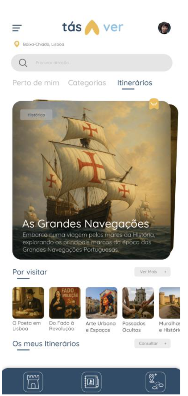
The dense grids that mixed visited and unvisited places across every category became a top menu with location-based highlights. The itineraries tab now opens on swipeable stacked cards, each paired with a short historical text, which feeds the cultural mission of the app instead of just listing routes.
The quiz: from one question to a game loop
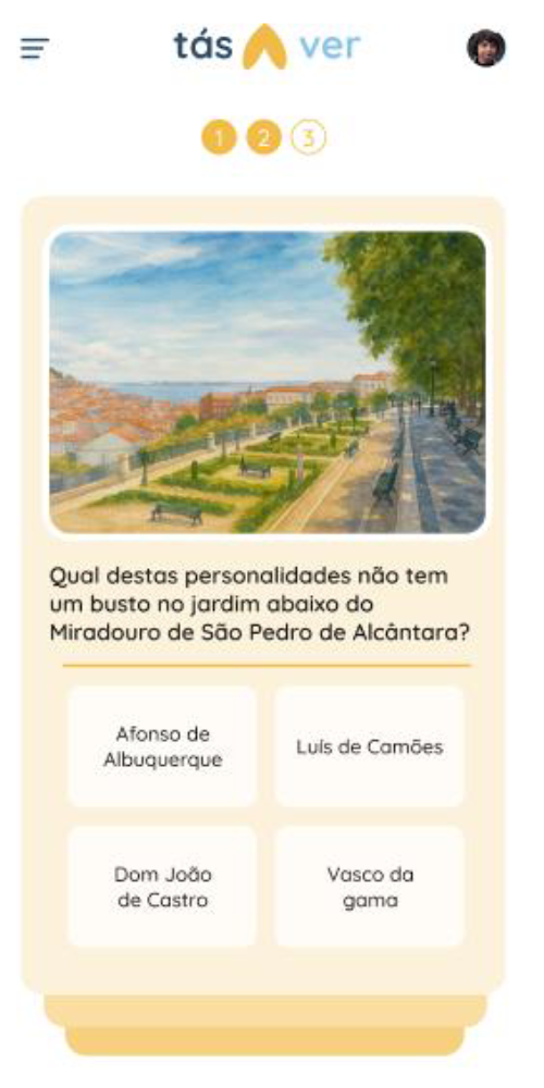
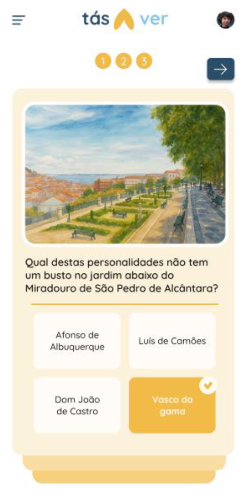
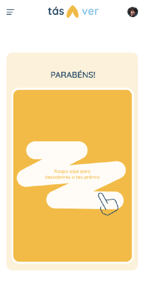
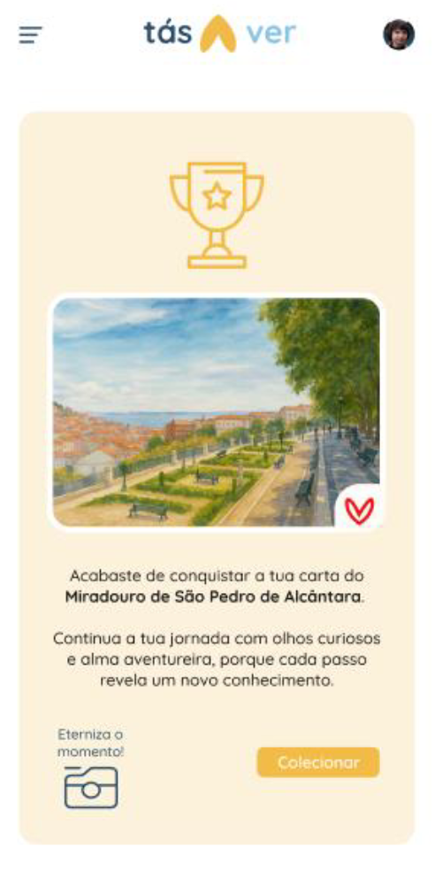
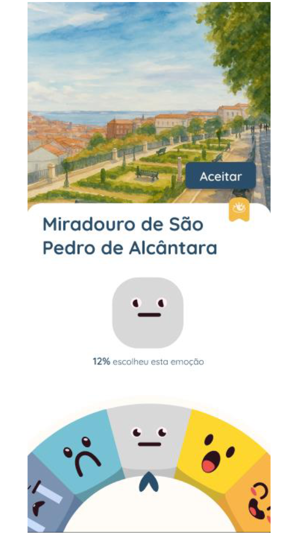
The original quiz was a single question and a congratulations screen. The redesign turned it into a proper loop: several historical questions with progress, a scratch-to-reveal virtual card as the prize, an in-app camera moment, adding the card to a personal album, and then the Emotion Wheel, where you pick the emotion the place gave you and see the percentage of visitors who felt the same.
Navigation identity
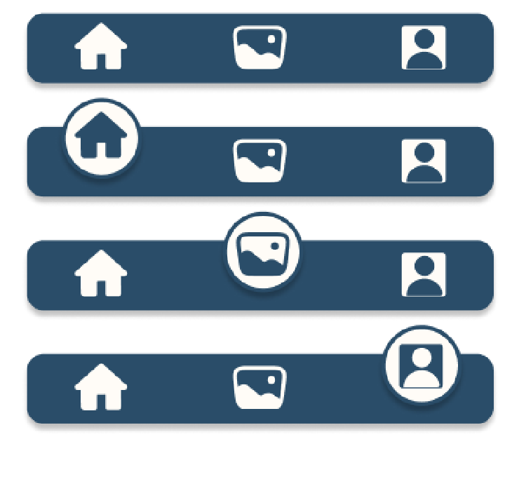
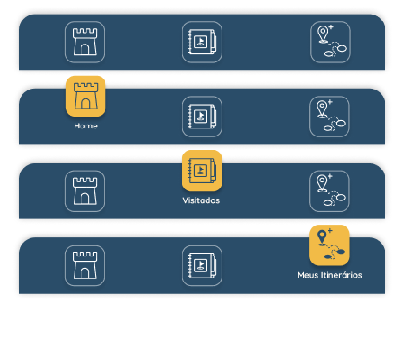
Generic home, photos and profile icons were replaced with custom ones tied to the app’s world: a tower for home, an album with a flag for conquests, an itinerary icon for user-created routes. The profile slot itself was swapped for direct access to “Os Meus Itinerários”, since that’s what people actually came back for.
Evaluating usability and emotion
An app whose whole premise is emotional engagement can’t be evaluated on task success alone. We designed a four-method protocol to measure usability, comprehension and emotional impact.
- Think Aloud, with a scripted set of tasks guiding participants through the core journey (finding an itinerary, reading a monument’s state, unlocking and completing a quiz, finishing a visit) while verbalising their thinking.
- Functional Understanding Test, direct open questions on six interface elements: the heart icon, the bottom menu, location use, the eye icon, the camera, and the closing emojis.
- System Usability Scale, administered in person after the hands-on session.
- Geneva Emotion Wheel, where participants identified the emotions they felt during the session and rated their intensity.
10 participants, all aged 19 to 25, deliberately homogeneous and aligned with the app’s young, digitally active target audience, completed the sessions in a controlled setting, on a smartphone running the high-fidelity prototype.
Results
Usability: SUS 83.75
Individual scores ranged from 72.5 to 92.5, with a mean of 83.75, which sits in the band conventionally described as excellent. Users perceived the app as accessible, well structured and low-effort.
Emotion: interest, everywhere
On the Emotion Wheel, 9 of 10 participants reported interest, which was also the most intense emotion at 4.22 out of 5. Fun (n=5) and pleasure (n=4) followed, while pride, joy, admiration and curiosity each got one mention. The only negative was confusion, mentioned once and at low intensity (2.0). During sessions, spontaneous reactions backed this up. One participant said “os bonecos estão bué fofos” (“the characters are so cute”), and praise for the visual style came up repeatedly.
| Emotion | Participants | Mean intensity |
|---|---|---|
| Interest | 9 | 4.22 |
| Fun | 5 | 4.00 |
| Pleasure | 4 | 4.00 |
| Pride, joy, admiration, curiosity | 1 each | 4.00 |
| Confusion | 1 | 2.00 |
Comprehension: the conventional wins, the clever needs help
The heart icon and the closing emojis were understood by essentially everyone. The eye icon was correctly read by most as a visited and unvisited marker, so the pun worked. But the quiz padlock, the navigation iconography and the time selector generated hesitation and wrong guesses. One participant said “não percebi os itinerários, pensava que era só uma imagem com texto” (“I didn’t get the itineraries, I thought it was just an image with text”).
All 10 participants completed the tasks. The friction was interpretive, not blocking.
Learnings
Emotional design is measurable. Pairing SUS with the Geneva Emotion Wheel meant we could say more than “it’s usable”. We could show the app produced the specific emotional state it was designed for, interest, and quantify its intensity. Usability and emotion are different instruments answering different questions, and this project needed both.
Delight and confusion coexist in the same interface. The same sessions that produced “so cute” produced “I thought it was just an image”. A high SUS doesn’t mean the work is done. The itineraries, the padlock and the nav icons all need clearer affordances, and a first-run tutorial is one of the first items on the iteration list, alongside the more glamorous ideas like social sharing of cards and AR emotion layers left at physical locations.
Critique is a design material. The gap between the first proposal and the redesign is the most visible evidence in my portfolio of feedback being processed rather than absorbed. Every suggestion was triaged for impact and feasibility, some were rejected deliberately, and the ones we took reshaped the homepage, the quiz and the app’s entire visual identity.
What the numbers can’t tell us. Only the redesigned prototype was evaluated, so there’s no SUS score for the first proposal and no before-and-after comparison. The redesign is better argued, not measured. Running the same protocol on both versions would have been the rigorous move, and it’s what I’d do differently.
Test where the product lives. All sessions happened in a controlled setting, but tásAver’s core mechanic is being somewhere. The clearest next step is in-situ testing along a real itinerary. A lab can validate comprehension; only the street can validate the experience.